The best way to start a new month in your bullet journal is by adding a fabulous, descriptive, fun, inspiring and creative first cover page. The best thing about creating your own bullet journal entries is, that you can make it your own. These can match your mood, emotions, memories, ideology or simply your own view on the month, for which the cover page is being created. I often wonder what will this month bring and if the feeling I have now, last the whole month? Here you will find some of my favourite BuJo cover pages. Enjoy!
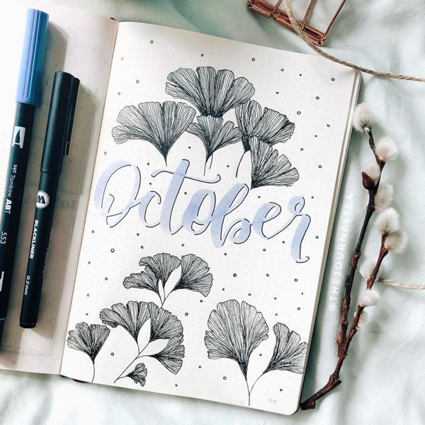
Photo credit: thejournaltea
This simple and monochrome cover page with these wonderfully intricate yet simple leafs, or maybe they are flowers. I can just imagine how meditative it is to draw the lines, focussing on just one but then, in the end, you get the whole picture in front of you. The other thing I adore is incorporating calligraphy as the statement of the page.
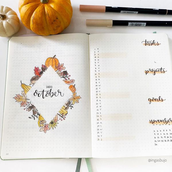
Photo credit: ingasbujo
Here you will find a very clever and beautiful idea of blocking out an area, in which you can later add other details, like the month, and drawing the images that represent the said month to you. This creates creative, yet clean view on the page. It also gives a great perspective on what the particular month means to you. Is it pumpkins and all? Only you will know.
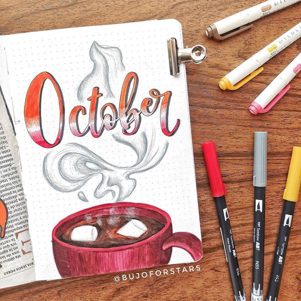
Photo credit: bujoforstars
Mmmm…when I saw this cover page, I got to the kitchen to make my own hot chocolate drink. This indeed was an inspiring and delicious cover page. Don’t know about you but I often get so busy, that I forget to drink enough liquid and this is a great idea how to remind myself each day to do it.
4. Make It Pop
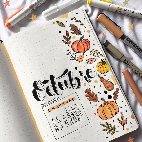
Photo credit: clubnotes
Yes, it is calligraphy time once more. This gorgeous cover page, not only has a lovely page organisation and beautiful autumn images, but my favourite – stylish writing. Just look at the brush technique that was used here, together with different helping strokes to highlight the bottom right parts of each letter and a grey shading. It makes the word float in the air.
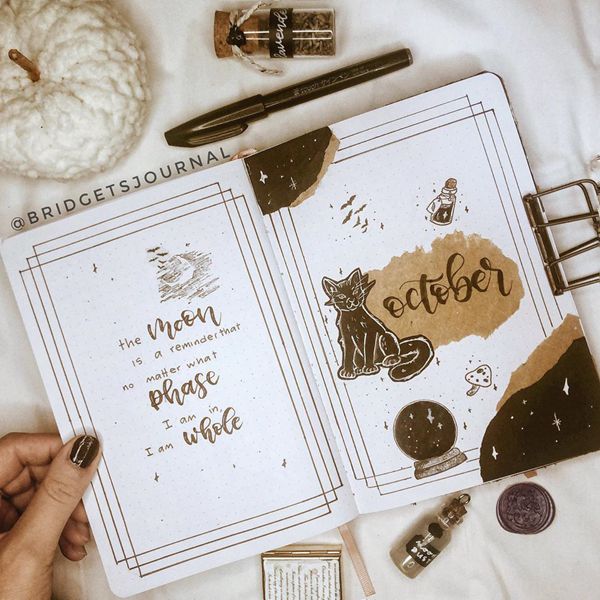
Photo credit: bridgetsjournal
There are days and even months when each of us needs an inspirational quote to lift the spirits. This in particular is very inspiring and makes me reflect that no matter what hardships come my way, I’m always one with myself and will get through these. The drawing on the opposite page complements the quote and balances out the cover spread.
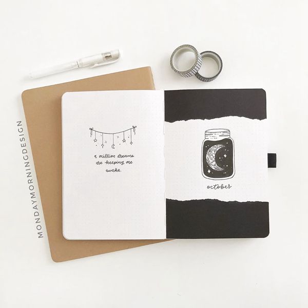
Photo credit: mondaymorningdesign
Similarly, like the above one, this double page cover perfectly balances one page opposite the other. That’s also a great idea, to make your own quotes or find the one that reflects you. I like looking back at my BuJo’s and remembering the particular moment , event or occurrence in a specific period, and the faux ripped page effect is pretty cool too.
7. Making The Cover Be Your Goal
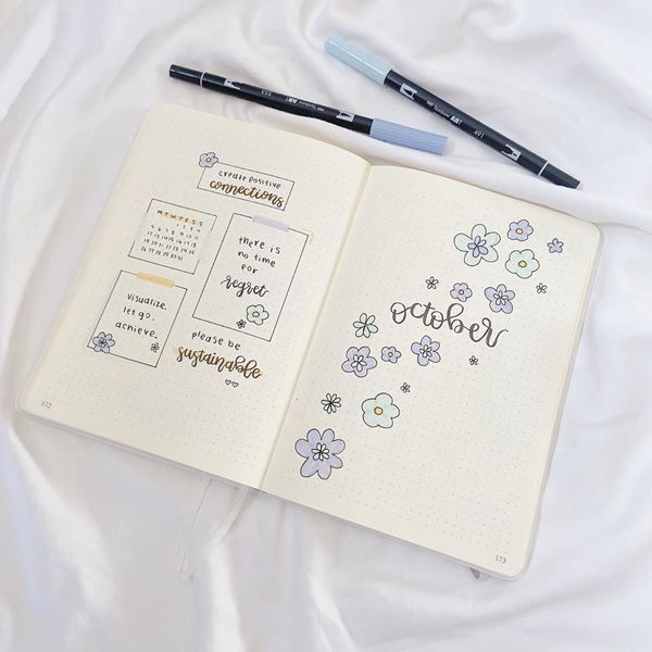
Photo credit: sydneyann.journals
This simply adorable cover spread isn’t just beautifully structured and inspiring. The idea to incorporate a few goals in the particular month and as the main points in the cover, is really clever. Imagine, each month reminding yourself of the most important goals that you have set yourself. That is very smart.
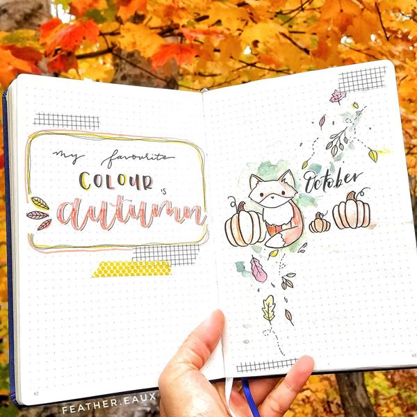
Photo credit: feather.eaux
Loving this cute watercolour cover page with the autumn leaves, pumpkins and one of my favourite animals – the fox. I really like the spin on this artwork, keeping it light and minimalistic with subtle shades and colours.
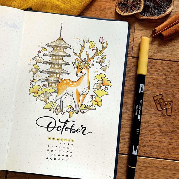
Photo credit: kotose.journal
This is such a beautiful cover page, with the integration of autumn and the season’s animals together with the author’s perception of a city and its architecture. It makes me feel like I’m in a magical story and just waiting for it to come to life.
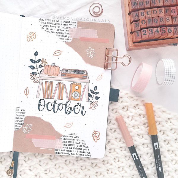
Photo credit: veronicajournals
When I think about journaling, a combination of an agenda, a sketchbook and a scrapbook, comes to my mind, filled with creative ideas from the early childhood. This is a great example of a mixture of it all and going back to the basics. Simple and sleek.
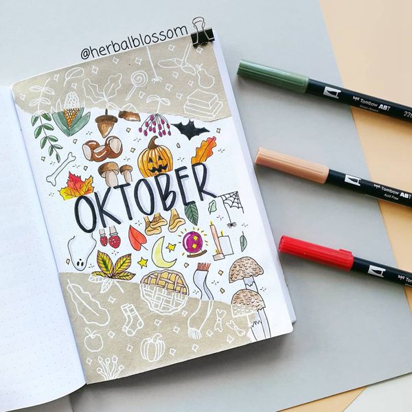
Photo credit: herbalblossom
Why not create an effect that the images are still alive on a different pattern and paper. Really liking this idea of the same artwork expressed in different ways and styles. And the images are completely adorable with the slight hint of Halloween approaching.
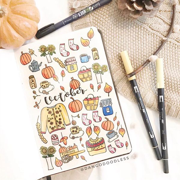
Photo credit: dangodoodless
I adore art and this cover page is absolutely hyggelit, which is the Danish way to say cozy, warm, and has a feeling of hugs and home. Really liking the way the overall style has been kept, with Nordic sweaters, tea and jam, to make the feeling come to life.
13. A Touch Of Gold
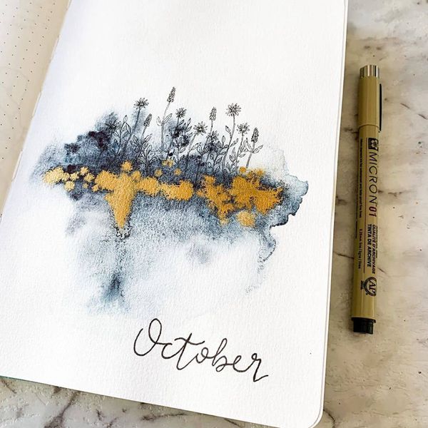
Photo credit: scribblesthatmatter
Art it is again, but this time the main point is to keep it simple and slightly unfinished, even though it is the finished product. The dark shades of deep blues, sets the scene of the dark fall afternoons and a splash of gold, reminds that there is light there too. The golden autumn at its heart.
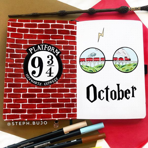
Photo credit: steph.bujo
Such a wonderful idea of making one of your favourite books and stories into a double cover page of a specific month. The red brick wall gives a show stopping and an aww moment. The best thing is that you don’t necessarily need to be good at art or drawing people to portray the idea.
15. Enter Halloween
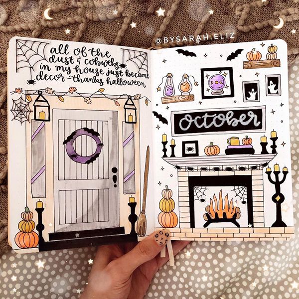
Photo credit: bysarah.eliz
This double page Halloween cover spread is very inviting. It’s like I’m invited trick or treating at someone’s house but instead of being spooky, it is magical, cozy and heartwarming. What would your Halloween house look like?
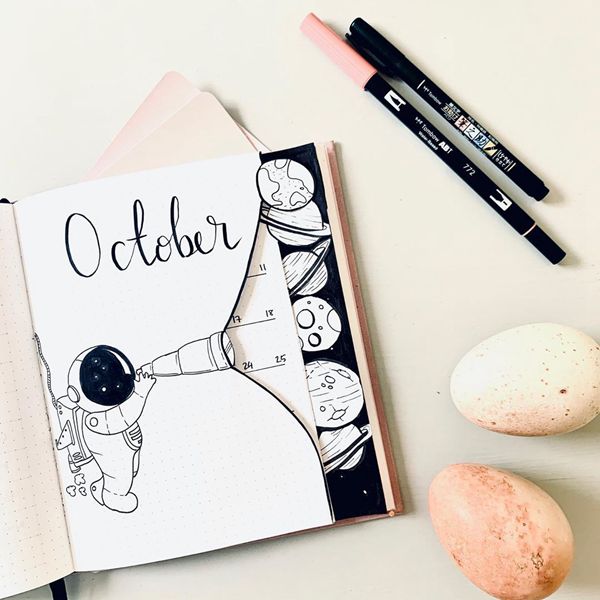
Photo credit: bujo_by_sarah
A very creative perspective on this cover, that leads into the whole month. How cool is it, for each page to have its planet that opens the doors to all kinds of possibilities? What else could you have instead of planets – autumn leafs, ghosts, cozy fall items?
17. Make It Pop
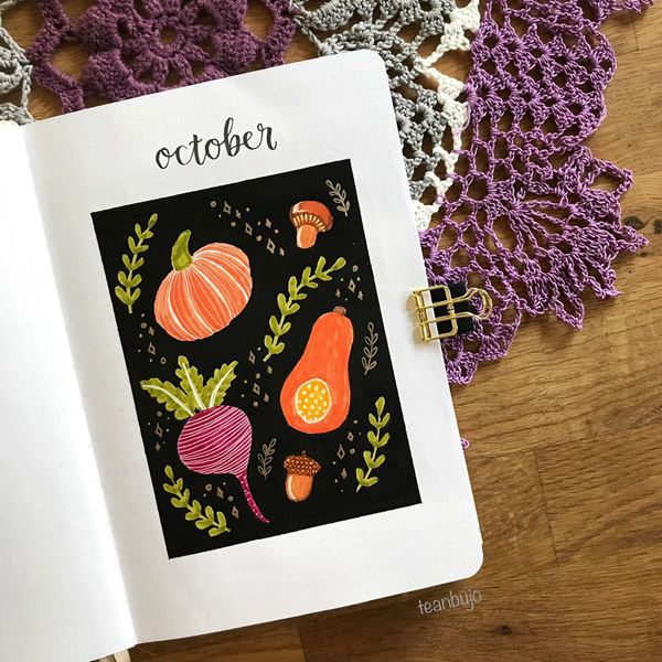
Photo credit: teanbujo
The colour contrasts here make the whole page pop, so if you are looking for a show stopping cover, this is the place. By adding the black background you can make the delicious pumpkins and beets look even juicier than they are. Yum yum yum.
18. Keep It Simple
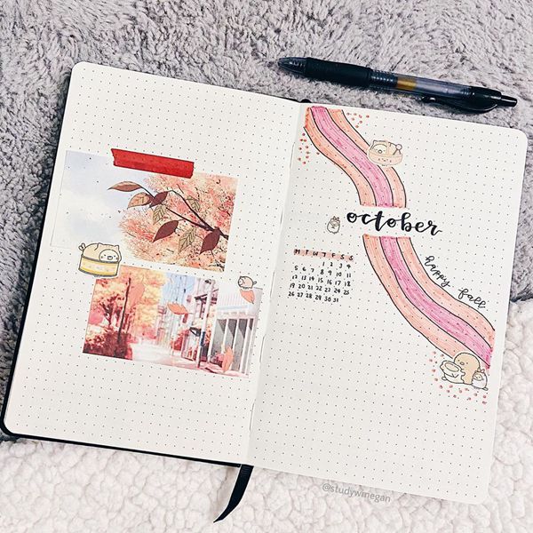
Photo credit: studywmegan
When the mood is not up to drawing and painting or it is not your strong side, you can still create gorgeous and inspiring monthly cover pages. I adore this one, with cut out pictures, stickers and simplistic viewpoint.
19. I Represent Me
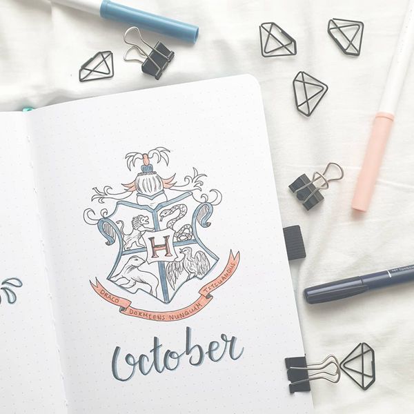
Photo credit: lisanplan
On those days when you want to feel royal, this is the way to go. Have you ever researched your ancestry and lineage? Maybe you already have a family coat of arms that you could display on your cover page, but if you don’t have one that’s ok too. You have all the possibilities to create the one that represents you.
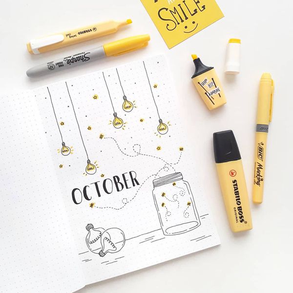
Photo credit: blog_emre
When the evenings get dark and cold, the best way to warm up is by creating light. Either with candles, lightbulbs, switched on, a string of lights or for those lucky ones a fireplace (artificial or not). Bringing light to your pages can be very heartwarming too.
21. Spilled Coffee
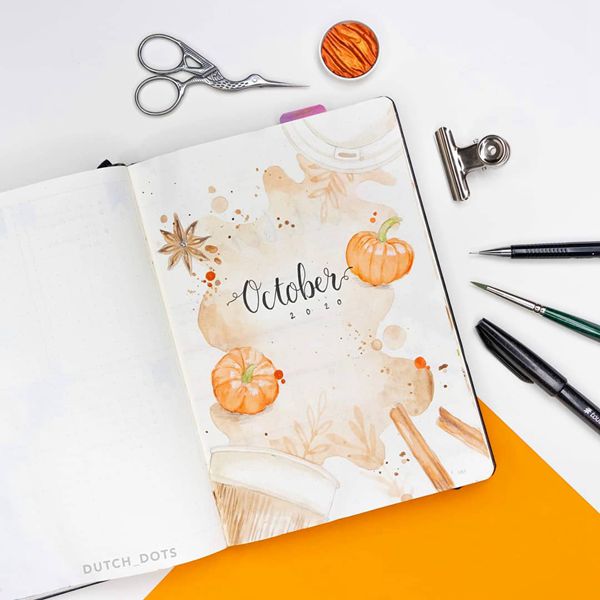
Photo credit: dutch_dots
Have you ever tried adding a smell to your pages? How about painting with food or drinks? This cover page reminds me of the fun one can have when drinking the morning coffee and then you are suddenly painting with coffee. Can you smell it? What else could you use to paint with?
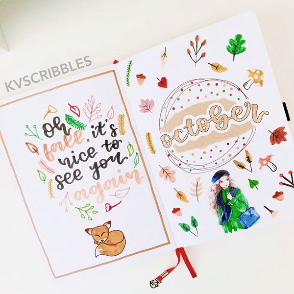
Photo credit: kvscribbles
Just look at this stunning double page cover spread, that reminds me of Alice in Wonderland. An even better idea is adapting it to yourself and your life. If you could be Alice in Wonderland right now, what would it look like?
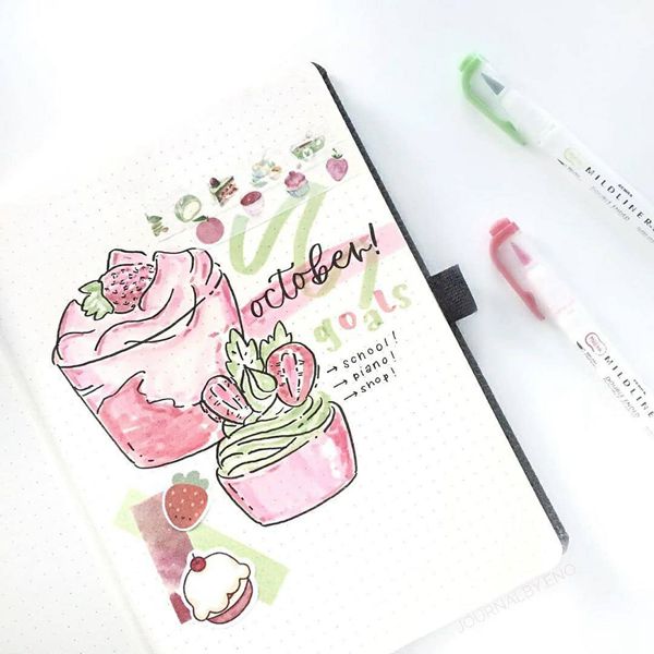
Photo credit: stationerypal_inspo
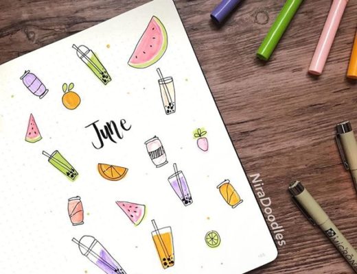
So, you are not into autumn at all? Or in your country it is the middle of spring? How about portraying what you love this month or any month. Your favourite dish, or drink of the day, music, art, hobby – well it can be anything you want it to be. This one is simply delicious!
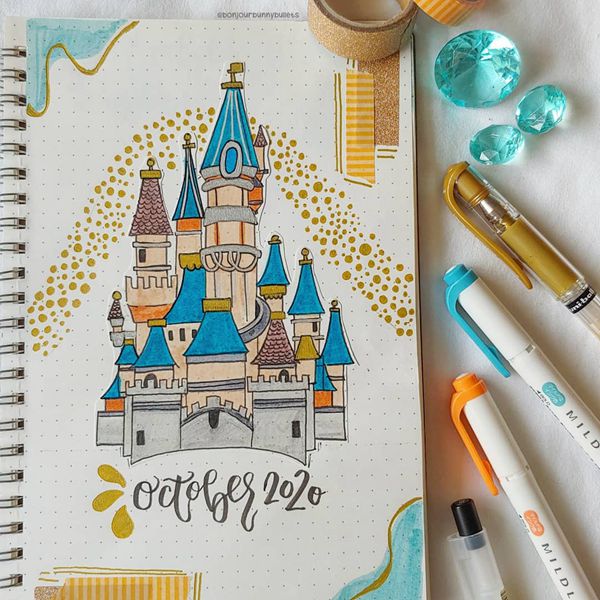
Photo credit: bonjourbunnybullets
Architecture always inspires me and castles can be very dreamy as well, and not always filled with ghosts. This is a great opportunity to explore what do castles look like around the world and copy one in your own way. You can also design and architect your own castle of your dreams.
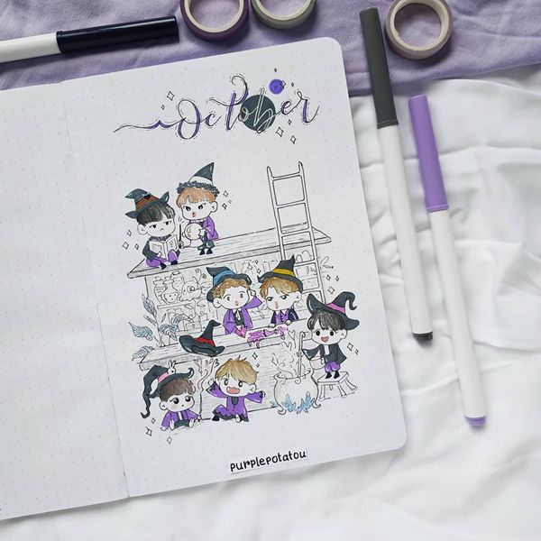
Photo credit: purplepotatou
As it is the month of Halloween and spookiness, I wanted to share this lovely cover page. Just imagine yourself being one of the students at the magic school, together with your best friends. Who would be there and what would your lessons be like?
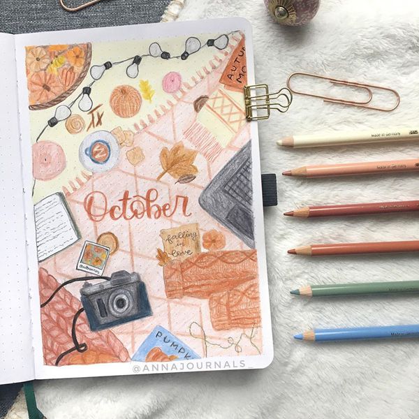
Photo credit: annajournals_
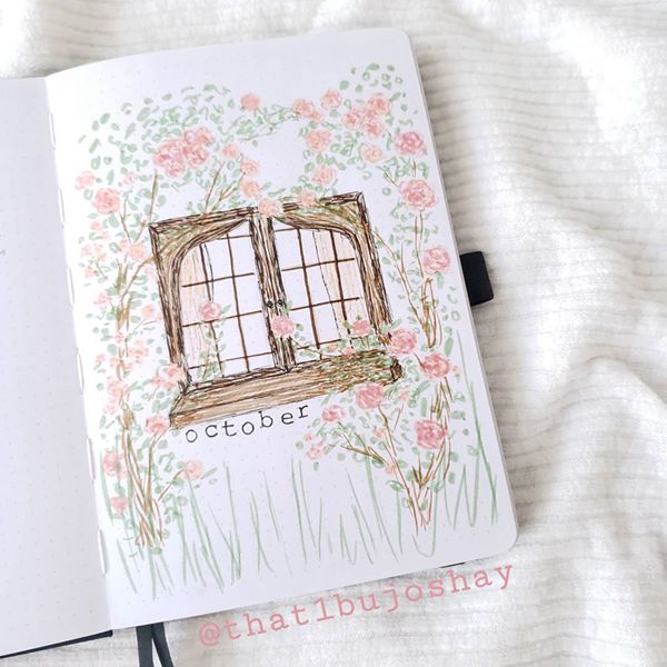
Photo credit: that1bujoshay
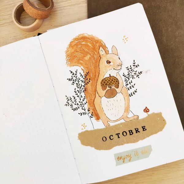
Photo credit: petitesfeuilles
Photo credit: scribblesthatmatter
Photo credit: raesdailypage
Photo credit: bujo._.inspirations
Photo credit: jambujos
33. This Is Me
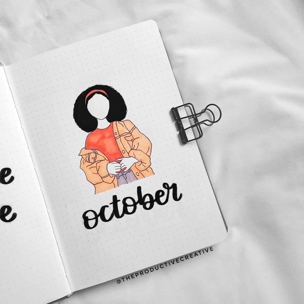
Photo credit: theproductivecreative
34. Comfort Is Where My Home Is
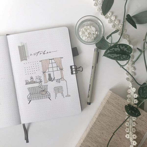
Photo credit: leelajournals
35. Witch’s Cauldron
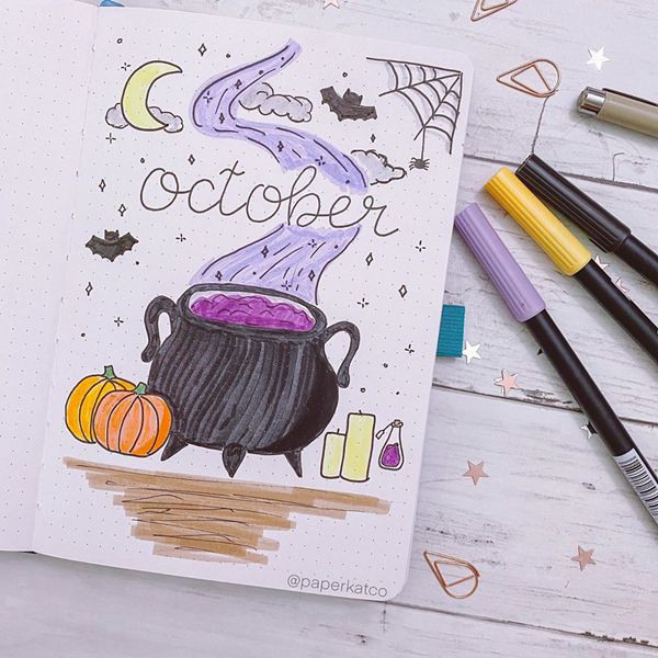
Photo credit: paperkatco
36. Pumpkin Cuteness
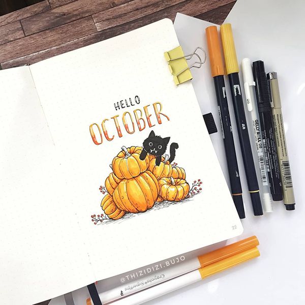
Photo credit: thizidizi.bujo
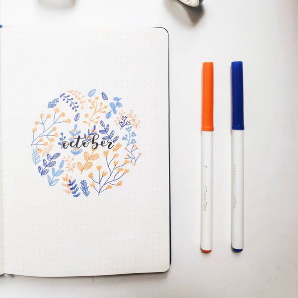
Photo credit: letsplanwithmimi
38. Minimalist’s Spooky Cover Page
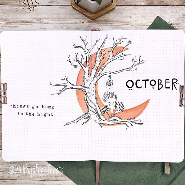
Photo credit: willbujofor.treats
39. Black And White Simplicity
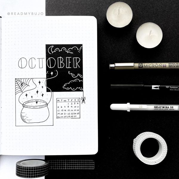
Photo credit: readmybujo
40. Pokemon Ghosts
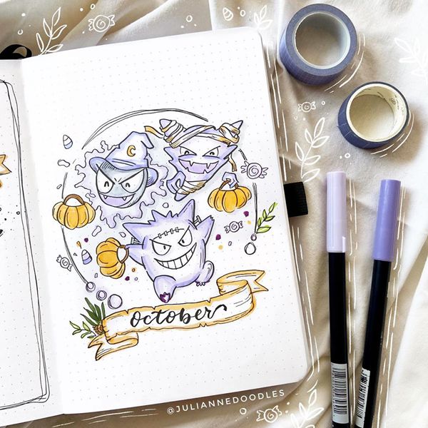
Photo credit: juliannedoodles
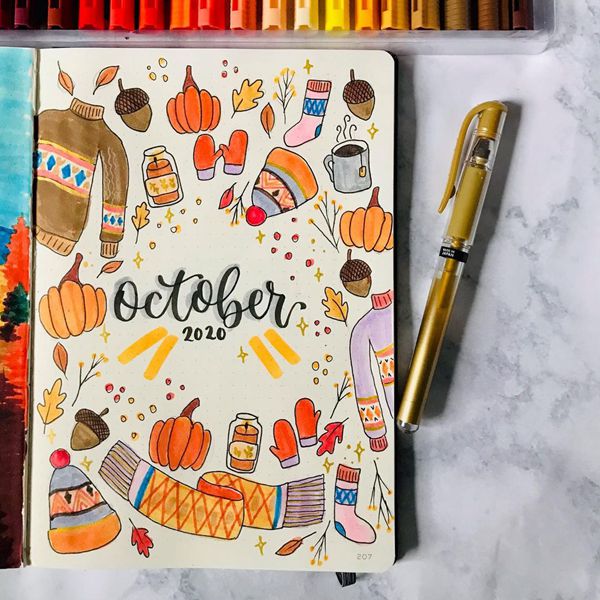
Photo credit: pens.plans.letters
42. Dreamy Nights

Photo credit: alexanndoodles
43. Pumpkin Tower
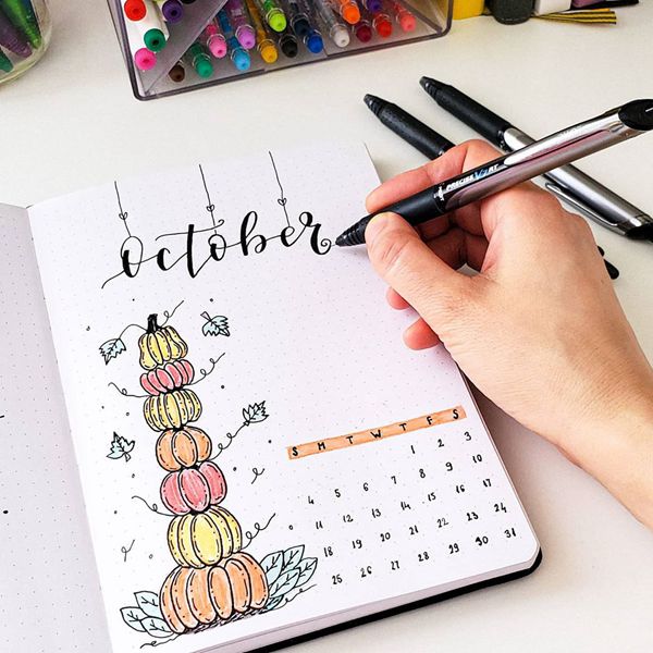
Photo credit: seed_successful_you
44. House Plant Minimalistic Simplicity
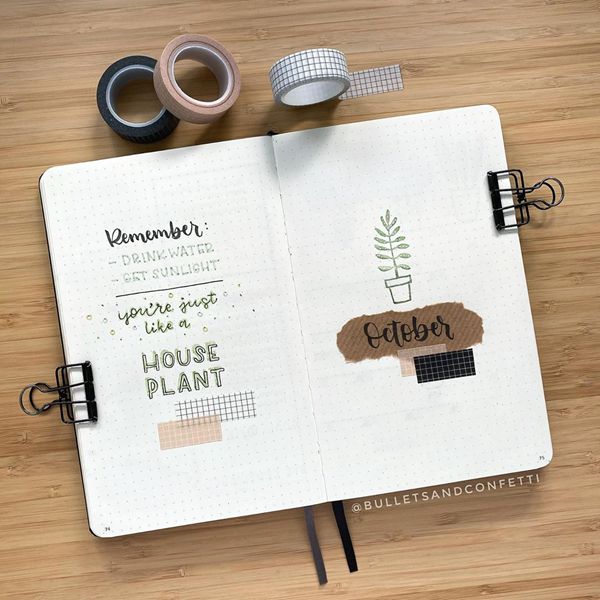
Photo credit: bulletsandconfetti
45. Autumn Is Here
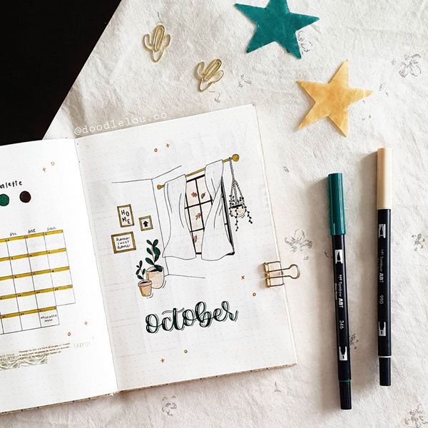
Photo credit: doodlelou.co
46. Cuteness Overdose On My Shelf
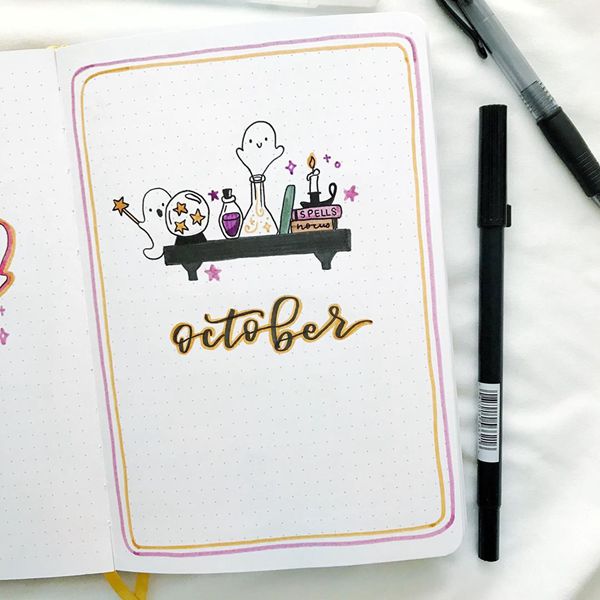
Photo credit: haleys_journal
47. Hidden Treasure
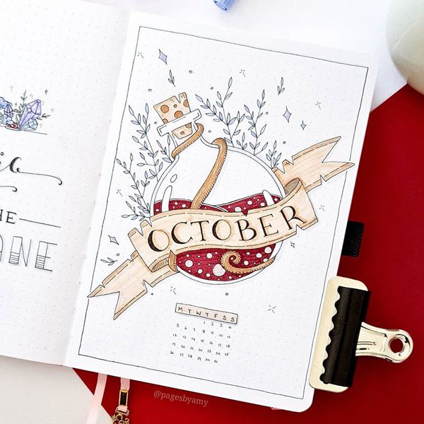
Photo credit: pagesbyamy
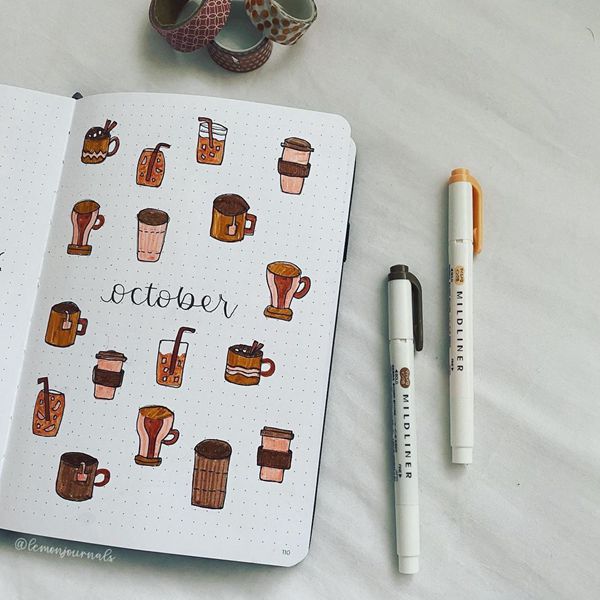
Photo credit: lemonjournals_
49. Colour Me In
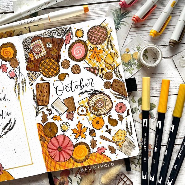
Photo credit: herbalblossom
50. Mexican Inspired Halloween
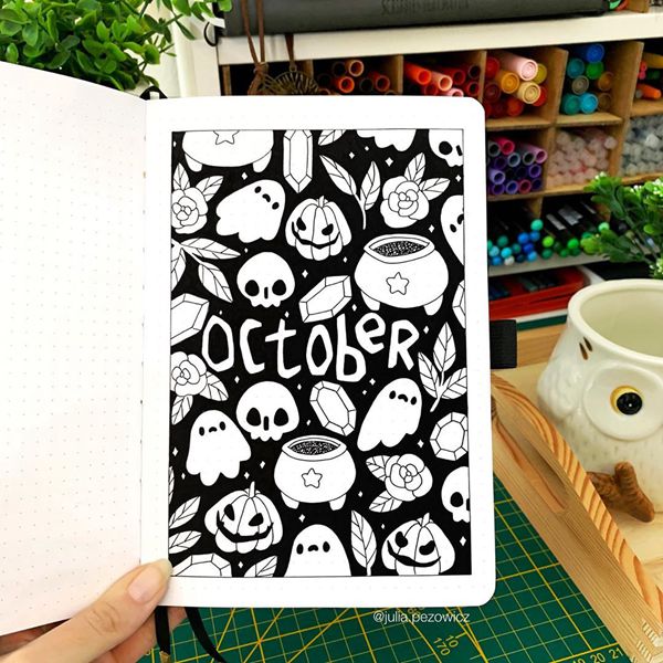
Photo credit: julia.pezowicz
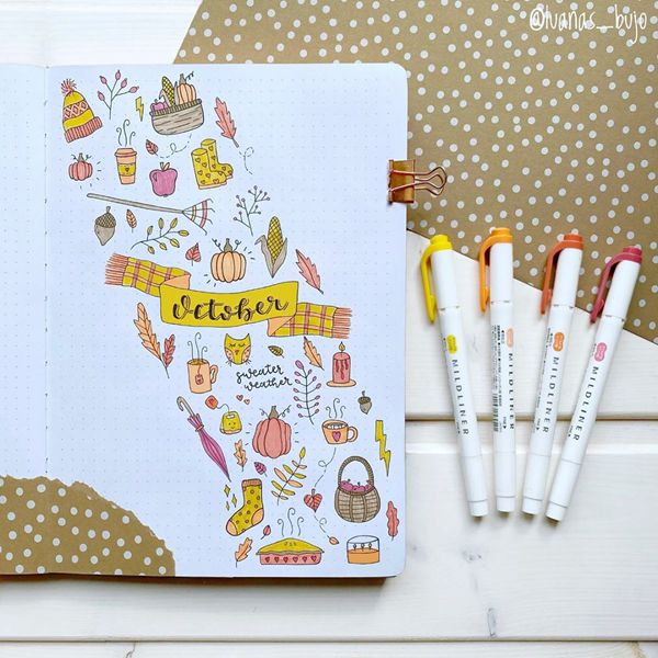
Photo credit: luanas_bujo
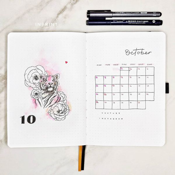
Photo credit: inprint.xyz
53. Girly Pinks
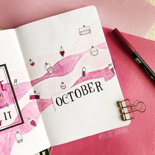
Photo credit: miloe.joanne
54. Autumn Outside And Summer Indoors
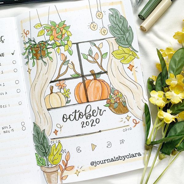
Photo credit: journalsbyclara
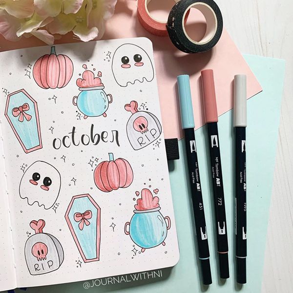
Photo credit: journalwithni
56. Cozy Halloween
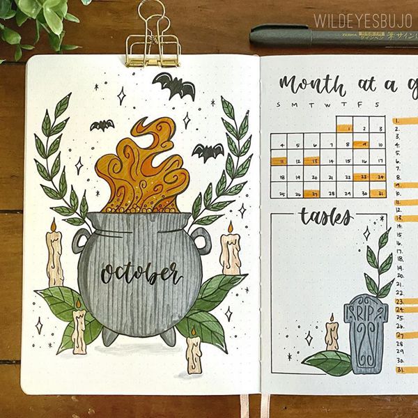
Photo credit: wildeyesbujo
57. Forest Dreams
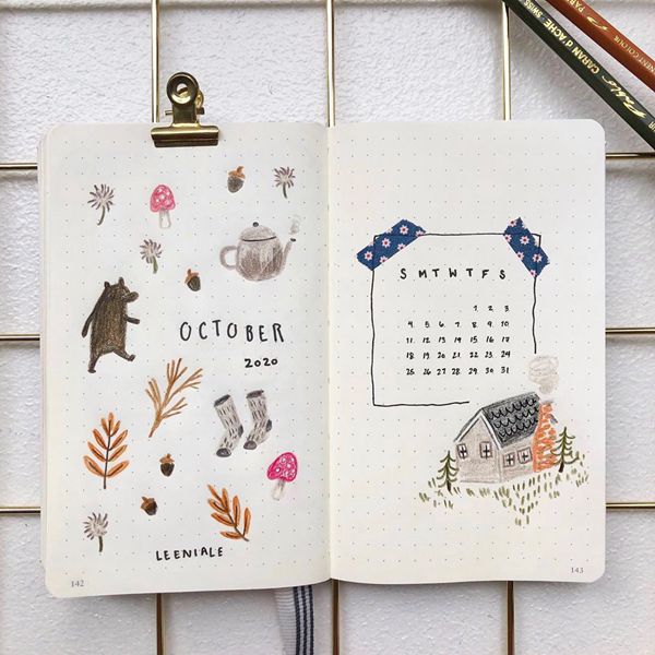
Photo credit: leeniale
58. Autumn Sleep
Photo credit: piasbujo
59. Pumpkin Cupcake

Photo credit: blossom_bujo
60. Mirror View

Photo credit: scribblesthatmatter

Photo credit: notikjournal
Photo credit: kathrynsarahjournals
63. Pumpkin Latte Is My Favourite

Photo credit: littleolivebujo
64. Boo…Scary

Photo credit: stephanymariebujo
65. October Soup
Photo credit: lalipop.lettering

Photo credit: dw_journals
67. What’s The Time?

Photo credit: bujo.sine
68. Hug Me Darling
Photo credit: dotted.pages
69. Rain On Me

Photo credit: raffie_journal
70. Smell The Magic

Photo credit: toastyjournals

Photo credit: bulletjournalwithroshni

Photo credit: somekindwords_
I hope these cover pages inspired you to create your own and keep to a similar style. Cover page for me represents the state of mind I’m in that month, my mood, my dreams and my aspirations. It can reflect your ideas, beliefs, wishes or even allow you to escape into another world. Remember, that these are only a few and you can make an interesting spin on them. Also, below you can find a list of many more ideas, that I absolutely loved. Get your creativity on!


No Comments